Work
Estimated total at the checkout for online shopping
Research insight that increased conversion rates and incremental revenue
September 2022
UX Design
Analytical research
What: Design, research and AB testing of the ‘Estimated total’ feature in the checkout flow of Countdown’s website and Mobile App, one of New Zealand’s largest online retailers
My role: I was a Senior UX Designer in the Checkout & Pay Squad
Who else was involved: Experimentation squad, Checkout & Pay squad (PM, BA, Devs, testers)

Background:
During customer research on Countdown’s “change order” feature, we found that many customers didn’t understand how payment works. Most learned through trial and error, as payment details were only explained in the terms of service and hidden in the FAQs. Countdown places a hold on the card based on the trolley total at checkout, which is later adjusted for factors like actual weights of items such as fruit or veggies. This led to frequent calls to the call centre about discrepancies between the order confirmation and the final charge.
Process:
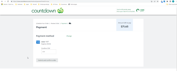
 Checkout prior to change, "Amount left to pay" confused customers and led to many calls to the call centre as the charge differed to the total and order confirmation total
Following this insight, we reviewed the checkout flow and looked at competitors and comparators online checkouts as well as third party research libraires. We noticed that many competitors used 'estimated total’ during the checkout flow, whereas Countdown displayed “amount left to pay” on the payment page and ‘total’ in the cart/checkout.
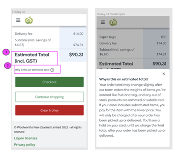
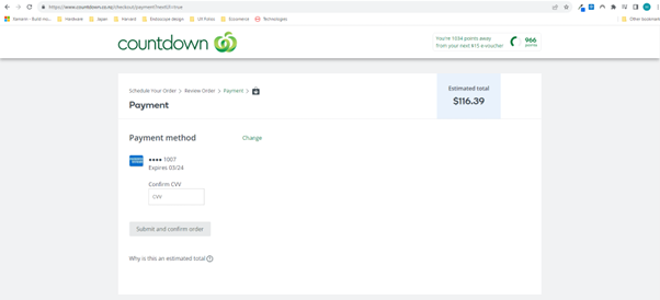
 Checkout after to change, "Estimated" made it clear that the fianl amount chagred may be different due to the actual weight of products like fruit and veggies
Design and hypothesis
Guided by Countdown’s design values of transparency and honesty, the next step was to form a hypothesis that updating the language and providing new supporting materials across the checkout flow would help customers trust Countdowns online payment processes, increase conversion rates and reduce calls to the contact centre about payment differnece between the order confirmaiton/checkout total and the final billing amount charged to the customers credit card.
AB testing
We decided to use AB testing to test the hypothesis, making a change firstly only on the payment page to display ‘Estimated total’. This method was chosen to reduce any risk to the business of customers checkout conversion rates or average basked sized reducing. Improving these metrics was one of the Checkout & Pay squads key goals.
The test was shown to a small percentage of traffic for a few weeks and we reviewed the key metrics (basket size, checkout conversion rates/abandonment). The results were all positive, higher than expected, so we decided to retest the experiment to a larger % of traffic and introduced the change across the checkout flow. We also provided customers some context with a ‘why is this an estimated total?’ which displayed a modal with the explanation. This second test again displayed very high improvement scores across they key metrics.
Business outcome
The result was a higher conversion rate which increased expected incremental revenue, lower calls to the support centre on that issue and the design changes were implemented as a permenant feature in the checkout flow including cart, payment page, order confirmation page across web and app.